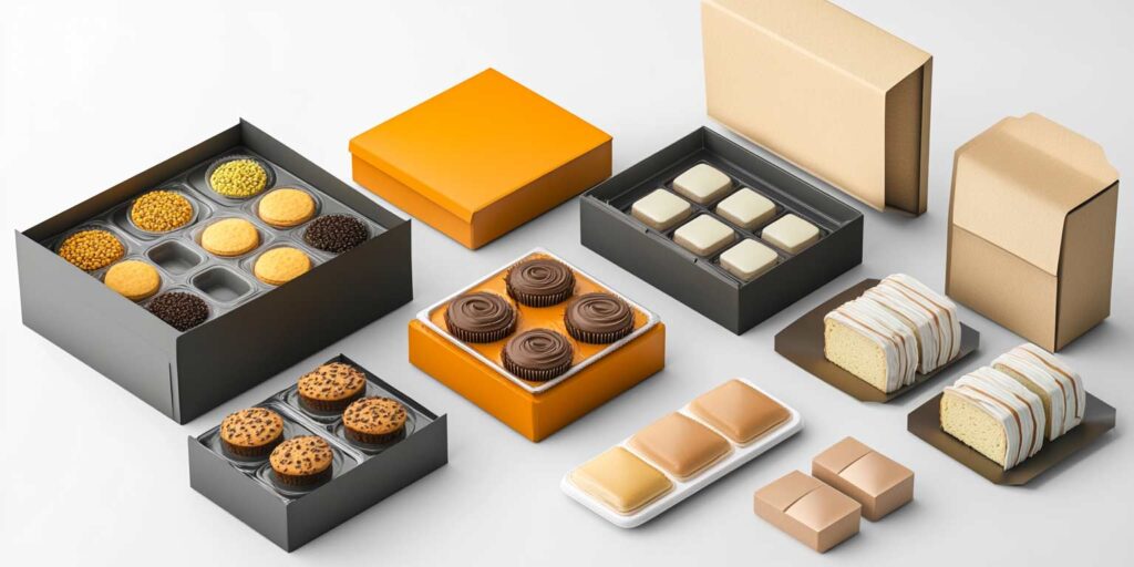
Food packaging design is more than just a container for your product—it’s a powerful tool for engaging customers, conveying important information, and setting your brand apart. Whether you’re launching a new product or rebranding an existing one, mastering the “four C-principles” of food packaging design—Clarity, Creativity, Consistency, and Consumer-Centricity—is crucial to creating packaging that resonates with your audience and helps your product succeed in the competitive food market.
In this guide, we’ll break down these essential principles and discuss key technical aspects, such as the ideal DPI for food packaging, the best design software, and whether Figma is a suitable tool for packaging design.
1. Clarity: Make Your Food Packaging Easy to Understand
Clarity is especially critical in food packaging design because consumers need to understand what they’re buying immediately. When people are shopping for food, they often make quick decisions, and unclear packaging can lead to confusion—or worse, missed sales. Essential information like the product name, ingredients, nutritional facts, and allergens should be easy to spot and understand.
Key points for clarity in food packaging:
- Highlight the product’s name and main ingredients clearly.
- Display any dietary labels (e.g., gluten-free, vegan) prominently.
- Ensure that the nutritional information and expiration date are easy to find.

Clarity builds trust with consumers, as they can confidently know what they are purchasing without needing to study the packaging for too long.
2. Creativity: Make Your Packaging Stand Out on the Shelf
Creativity is where you can differentiate your food product from the competition. In a crowded grocery store aisle, your packaging needs to catch the consumer’s eye. Food packaging that’s visually interesting can make your product irresistible to potential buyers. Creative design elements—like unique illustrations, vibrant color palettes, or innovative textures—can communicate your brand’s personality and make your product memorable.
Ideas to enhance creativity in food packaging:
- Use bold, appetizing visuals that reflect the product (e.g., a close-up of fresh ingredients).
- Experiment with packaging shapes or materials that complement the product’s appeal (e.g., biodegradable pouches for organic foods).
- Incorporate transparent elements so consumers can see the product inside.
Creative packaging not only grabs attention but can also evoke emotions or associations that increase the likelihood of purchase.

3. Consistency: Strengthen Your Brand Identity
Consistency is essential for food brands because it helps reinforce your brand’s identity and builds customer loyalty. Every time a consumer sees your product, they should recognize it as part of your brand, even if you have a variety of products in different categories. From packaging design to the placement of your logo and tagline, maintaining a consistent look across your product line creates trust and makes your brand more memorable.
Consistency tips for food packaging:
- Maintain a cohesive color scheme and typography across your entire product range.
- Place your logo in a consistent position on each package for easy brand recognition.
- Stick to your brand’s visual identity, even if introducing new products or flavors.
Consistency not only makes it easier for customers to identify your products but also strengthens your brand’s presence in the market.
4. Consumer-Centricity: Cater to Your Target Audience
Food packaging should always be designed with the consumer in mind. Whether you’re appealing to health-conscious shoppers, families, or gourmet food lovers, your packaging must address their needs and preferences. Is your target market interested in sustainability? Opt for eco-friendly packaging materials. Are they looking for convenience? Design easy-to-open or resealable packaging. A consumer-focused approach ensures that your packaging enhances the customer experience, making it more likely they’ll choose your product again.

Considerations for consumer-centric food packaging:
- Is the packaging functional? (e.g., easy to open, resealable, or portion-controlled)
- Does the design reflect the values of your target audience? (e.g., organic materials for eco-conscious buyers)
- Does it protect the food product effectively during transport and storage?
By focusing on the consumer experience, you ensure your packaging design doesn’t just look good but also serves a practical purpose.
What DPI Should I Use for Food Packaging Design?
For high-quality food packaging, it’s crucial to use a minimum DPI (dots per inch) of 300. This ensures that your text, images, and logos are sharp and clear when printed. Anything below 300 DPI may lead to pixelation or blurriness, which can make your packaging look unprofessional. Especially for food packaging, where details like ingredient lists and nutritional facts need to be legible, 300 DPI is the gold standard for quality printing.
What Software is Best for Designing Food Packaging?
Designing food packaging requires precision, and the right software can make the process much smoother. Here are some top tools used by packaging designers:
- Adobe Illustrator: Perfect for creating scalable vector designs, ensuring your packaging looks crisp at any size.
- Adobe Photoshop: Ideal for manipulating images and creating detailed mockups of food packaging designs.
- Esko: A specialized tool that focuses on packaging design and production, making it a favorite in the industry for creating food packaging.
These tools offer the features necessary for professional packaging design, ensuring that your food product looks appealing and is ready for the print process.
Can You Use Figma for Food Packaging Design?
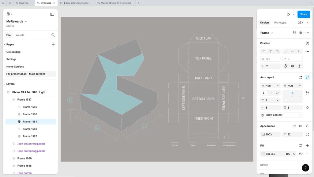
Figma is great for collaborative design projects, but it’s not typically used for food packaging design. While you can create initial concepts in Figma, it lacks some of the advanced features needed for print-ready designs. For food packaging, you’ll need to work with software that supports high-resolution outputs and print-ready formats like CMYK color models, which Figma doesn’t handle as effectively. If you’re working on digital product design, Figma is excellent, but for packaging, tools like Illustrator or Esko are better suited.

On the Flip-Side
Creating effective food packaging design is a blend of art and strategy, and the four C-principles—Clarity, Creativity, Consistency, and Consumer-Centricity—serve as a roadmap to success. By focusing on clarity, you make it easy for consumers to understand what your product offers. Creativity helps your product stand out, consistency builds trust and brand recognition, and consumer-centric design ensures that your packaging meets the needs and expectations of your audience.
Additionally, paying attention to technical aspects like DPI and using the right design software ensures your food packaging looks professional and stands out on the shelf. With these principles in mind, you’ll be well on your way to creating food packaging that delights consumers and drives sales.

